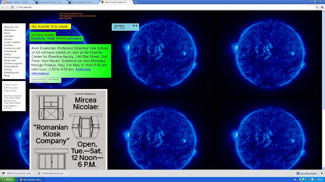
For a start with this bad website, we didn't even know what it was about at first, we had to read and find out, it is even a university website! Wow I am sorry to say this but this is a terrible website, it took me a while to find the navigation too which is in a plain white box which is boring too.. And I have to say without reading what the background is about, "what is this about?'. I have to say that this website is very poor.
Okay now this website gets a 10/10 for making me laugh about how bad this website is. I could describe this website in one word 'clutter'. This is an absolute mess which makes it hard to get around, a plain background and just rubbish everywhere. There is no structure and order this this... thing. What is what, where is where and why did they even go through with publishing this design? So many questions that needs to be found out about this terrible excuse of a website.
okay now thats out of the way... lets focus on some better websites.

Now this is a good website, a nice easy navigation, a simple but effective background which doesn't make anything hard to read. Also it has its main selling points out on view which isn't cluttered or messy. A contact area at the top which also helps. A simple logo too. I cannot see a flaw in this website.
As much as I hate the Iphone I have to admit this is a good website. A nice simple and easy to read navigation, information layout which is easy to read and simple. Also has a simple background which goes well with the text. And finally a straight to the point seller which tells you about the product with an instant order now button. The colours aren't bright either which makes it easier to read and not so much in your face. Also it gets to the point about what they do with big bold letters.


